BLOG IS NOW CLOSED.
I have really enjoyed all of my A Level Media Studies Coursework and the research involved! I learnt a lot about different technologies but also about my own abilities.
Thanks for viewing my blog :)

Saturday, 10 March 2012
Friday, 9 March 2012
Final Music Video
Kim Bradbury final from Caroline Birks on Vimeo.
This is the final version of my music video, I have taken on board some of the last audience feedback that I got. For example I made the beginning a lot slower and more like how I first had it, I also removed the "pony scene" that my teacher didn't like where she in getting on the roof. The ending is similar however I did include the 3rd jump cut with my dog Bailey which means that the ending is shorter however I didn't end it with Bailey, I kept it with her in the box. I did this because that is what I wanted and the audience feedback was mixed about this ending anyways so there was no complete reason for me to do so. I believe that it works really well because she is ending up where she started and each character is back where they belong. The Jessie J that is the "star" is on the roof and has found freedom from her crazy self that is quite happy to be locked up in a crazy dream world whilst the younger and the Jessie J that we flashback to is happily in bed with her dog. I also changed the scene after they touch hands putting them ontop of eachother because I wanted the overlapping idea to carry on and I think that this looks really effective and gives the audience yet another thing to wonder at. In all, I am very pleased with this video and I didn't want to stop filming/editing for it!!
Final Advert

I decided to use a similar picture for my advert as it would slightly differentiate between the different pieces however be similar enough so that its obviously recognisable. I included the different companies that support Jessie J, places to download or buy the song, I explained what it was (that it included a DVD too), her website and the release date. I also ensured that the front of the album cover was on there so that people knew what it looked like. I went for similar colourings to the album cover and I used the same text throughout. The same for the Jessie J, the front used on "Who You Are" is also used on the song name "I Need This" and most of the other text is what I used (and so does Jessie J) for her track listings. I also used the running theme of the "light box" on here as I did on the digipak.
I am really pleased with this poster and could see it being used in real life.
Final Digipak
Here is my final Digipak: (all images are full sized apart from the below image of them all together and the inside cover because otherwise they are too big)


.png)


This is what my digipak will look like when it has all been put together (14cm by 43cm - 1/2 cm for each spine).
This is the front cover, a lot of editing went into each of the panels of the digipak however this took the longest as I had to make the base picture before I could even start. I smoothed out her face and got rid of any blemishes, I changed the saturation and I made the centre of her face brighter. In the tutorial that I included in a seperate post, it is clear how I photoshopped her face. I also edited her eyes making them bluer and brighter, the light box around them emphasises them even more. I included the text (which I found on a website) which is the text that Jessie J uses and I made it have a shaddow, the same was done for "Who You Are." I included a Parental Advisory sticker which I found on Google, the other sticker that I included which explains that it is Limited Edition would also appear on the front cover however it would be on top of the plastic outer packaging of the digipak so that the cover isn't ruined by a sticker.
.png)
This is the back cover, in the end I decided to use the same photo but the other way around, not because it was easier but because it looked better. I had made other back covers that were not easy to make but in the end, it isn't the difficulty that is important, it is the effectiveness, and I believe that this back cover is the best one I made. I included a bar code, the DVD logo, other logos of companys that support Jessie J for example Lava Records and of course the track listings. It is split up between the normal CD and the DVD where the music video would be, it is explained that live performances and accoustic versions of songs would also be included in this bonus CD. Text is included underneath the track listings which I found from the back of Jessie J's album cover, it includes details such as copyright issues etc. I blurred her face so that it wasn't the same as the front cover and so that the track listings were more visible, making the light box fit in her hands, emphasising the box shape she is making in her hands.
This is the 3rd panel on the outside which basically includeds extra information about Jessie, her songs and the digipak. I used the similar picture once again but yet again changing it slightly so that it doesn't get boring. I used the idea of the information on this panel from the digipak that I earlier posted about from Enter Shikari. I really like this panel as her hair is used as the background for the text. Once again the same text and the light box is used again to portray familiarity. I really like the mirror edge and I think that the whole front cover works together well as it is all about the main character of Jessie J.

This is the inside cover, it is slightly more simpler, focusing on the girl in the bed sheets who looks innocent and pure, the mirror image effect is used again as it is a running theme throughout the digipak. So it the light box that I have used to highlight the message that Jessie J has written to her fans. The centre picture is there as a shocking element because she looks slightly out of place but this is done on purpose because in the music video she feels out of place. I made the light around her brighter so that there is a focus on her too and that is could almost look as though an ironic religious light is on her, playing tricks on Jessie's mind. The fact that this character is used on the inside is because, these are the pockets for the DVD and CD so it is here that you will actually see the character of the Crazy Jessie appear. (on the left 14cm square the CD would go - inside the pocket. On the right 14cm square the DVD would go - inside the pocket. I have also included space for 2 1/2cm by 14cm spines and the middle 14cm square is just a picture.)
This is the spine, once again her eye appears as this is a running theme though out and so is the fonts that have remained the same. I think it is simple but effective and it shows that I have paid attention to detail remembering to include a spine in my digipak.

This is the final version of my sticker for the outside front cover of the album. I have moved the text around slightly from the first version so that it fits in better. I decided to stay with the pink theme for the sticker as I think that it looks girly and pretty without it being too over the top and because it is a sticker it needs to stand out from the front cover and not just blend in with the same colour scheme.
4. How did you use media technologies in the construction and research, planning and evaluation stages?
I have used many media technologies in making my video, both in terms of hardware and software. The hardware I used included a digital camera with video capabilities, a printer/scanner and a computer. The software used included Photoshop, Final Cut Pro X technologies, Paint and online blogger. During the making of the video I have increased my skills in using all of these and now feel extremely adapt in many types of hardware and software. Initially I used a PC as my computer, but due to the video making programme I needed to use an Apple Mac computer, and now feel confident using both computer platforms.


I used this software to enhance some of my pictures. I have used this programme before to make story boards of various friendships, by adjusting and superimposing images. I found some of the more advanced aspects of the programme tricky especially in making my Digipack, but I feel I have come to understand more of the capabilities of this programme and I think it is a very powerful tool. When I got stuck I either asked for help or searched on YouTube for what i wanted to do. It was definitely very important in making my Digipack as I cut images form the video and superimposed these cuts into Photoshop and then used the programmes effects to create the final result however most of the time, the shots that I used were actual photos and not stills from a video. I really love using this programme, and find it rewarding, although sometimes it can take up quite a bit of my time to get to the result that I was wanting.

I list below the main technologies that I used to produce my video and explain their main uses and how useful they were to me.
Digital Video Camera
 The digital camera I used also had video capabilities. I used the camera to get still shots to test the light levels of some of the scenes and to take photos to use on my blog. In some of the scenes I used a light to make sure that the images would not be too dark. I was familiar with taking photos and videos as I had used a digital camera in my short film last year, and I also like to take photos of any event that I go to, so I felt comfortable using the camera and video element of the camera especially as it was my own camera. Without doubt the digital camera and video was the most important technology I used as without it I would not have a video.
Scanner/Printer
 I used the scanner part of my printer to copy images to take into Photoshop so that I could build up a trial Digipack to get an initial feel as to how the final result would look. I also used it to scan pictures such as other digipaks and my storyboard so that I could put them on my blog. I found the scanner easy to use. This was a useful tool, but not essential.
Tripod
This was what I placed the camera onto so that it was safe and I was able to have a smooth and even film with varying angles. I was also able to make sure that the video I took would without any ‘camera wobble’ and the pictures would not be blurred and would therefore be of a higher quality. I didn't use it in every shot for example where Grace spins around on the roof however it was essential as I used it a lot.
Extendable Legs

I could adjust these legs depending on where I wanted my clip to be filmed from. eg. being filmed from below makes the actor seems bigger and therefore more important, the one I used also had wheels however this wasn't really essential.
Blogger

I found this extremely useful helping me in my planning; it also helped me to expand my thoughts and get feedback from others. I used this in my AS studies so I have no problem using it again for my music video this year. I really enjoy blogging and find it a very useful tool to get ideas and thoughts from others. I would post up small sections of my video and ask for comments, which I would then consider and maybe take on to improve the final cut. Without this, my research would not have been nearly as good so it was definitely essential.
Photoshop
I used this software to enhance some of my pictures. I have used this programme before to make story boards of various friendships, by adjusting and superimposing images. I found some of the more advanced aspects of the programme tricky especially in making my Digipack, but I feel I have come to understand more of the capabilities of this programme and I think it is a very powerful tool. When I got stuck I either asked for help or searched on YouTube for what i wanted to do. It was definitely very important in making my Digipack as I cut images form the video and superimposed these cuts into Photoshop and then used the programmes effects to create the final result however most of the time, the shots that I used were actual photos and not stills from a video. I really love using this programme, and find it rewarding, although sometimes it can take up quite a bit of my time to get to the result that I was wanting.
Final Cut Pro X

This is the main editing software that I used to edit my video. It is a very advanced piece of software and I am sure that there are many areas and effects that I could still find useful and interesting to use if only I had more time to explore it. We only had this programme for use on a Mac. I had not used a Mac before so initially I was a bit unsure of some of the short cuts or where to find other programmes on the computer, but this was soon overcome. I found the Mac was a far more powerful machine to use than my own pc and am considering buying one for when I go to university next year. This was probably the second most important tool that I needed to use in order to create my music video as I needed to take several of the scenes and reorder them to get the flash backs to coincide with the ‘story’ of the song.
Paint
Paint is the programme where I would paste my screen grabs from various programmes and also where I would analyse many pictures and then from here I would save it and then post the finished result onto my blog. It was useful but not essential.
Vimeo

This is the website where all of our final drafts of our films were finally uploaded to. It gives you a section called ‘stedsadvancedportfolio’ where you can view all of the videos from our school; this is good because it allowed me to compare my film with others from my class very easily and it was a simple place to upload the videos.
Youtube

This is the website that I used the most because it allowed me to view many film openings, sound effects, production companies, interviews with editor and so on. It is a very simple website to use and it has so many things on it. I also used it to embed videos onto my blog with their individual embed codes.
All these technologies were essential tools needed in making my video a success. I really enjoyed the editing process of my coursework and feel that the result that I produced has demonstrated this. Without Final Cut Pro X I would not have managed to make the video. The effects within the programme were so useful as some of my shots had not been bright enough and I was able to rectify this. I would really love to complete another project using this programme.
3. What have you learned from your audience feedback?
Audience feedback has been an important element of my coursework since the first audience questionnaire that I carried out which helped me to determine my target audience. I asked myself several questions that I could ask in a questionnaire to help me to determine who my target audience was; I had a rough idea however I wanted to back this up with evidence although I do know that the data collected may not be representative of all people's opinions. I asked 20 people to fill in the questionnaire I had created, then I blogged about the answers I had received. From this questionnaire, people said that they enjoyed a storyline the most and the things they expected most from a slow pop song was big voices, emotional lyrics, slow dances, people crying, big notes and a love story. I believe that I covered the majority of these areas and I did so due to my initial audience feedback, which therefore proves that it is very useful.
I found that even just by asking class members and friends to comment on my blog posts really helped too, for example when I was struggling to decide what photo should be the basis of my front cover or even what front cover to use, they offered advise and constructive critisism. I felt that this really helped me throughout my coursework as it is not just my ideas that are important but also, they helped me make decisions that I just couldn't make. Even Grace helped me with a few decisions which I took very seriously because she also takes Media Studies at A Level, for example she thought of the shot in the video where her back is to my garden and her arms are raised.
The majority of the audience feedback that I have recieved, however, has been on my music video; I asked the members of my class and many friends to watch my video with me and then tell me or annonymously writing their opinions (I did it this way also so that I could recieve critisisms without people feeling awkward because I know that these are very important as well); people also commented on my blog posts of the video as I went along. For example the video that I posted on YouTube (the pre-final cut) I recieved much audience feedback because I really just wanted to get it finished and to the best that I could. I recieved comments such as, "Maybe have a 3rd jump cut with Bailey" which I used to improve and then followed their advice, comments like, "You have to watch the video many times in order to catch everything so this means that the audience will want to watch it many times (repeatability factor)!" which made me feel really confident and happy with the video and comments like, "Final shot of mad Jessi needed? Definitely too long" which I partially chose to ignore because I know that although audience feedback is really important, at the end of the day it is my music video and I want things a certain way. Therefore I made changes because of the audience feedback however I didn't change everything that people didn't like as I felt that I didn't have to and also because there were many contradicting views with some people liking things that others didn't, for example, "Like the ending - shows that this is the different parts of her."
The last piece of feedback was an interview that I had with Grace who played Jessie J; I asked her how she felt about the production of the video and then the final video in general. The questions that I asked her were:
1. What would you expect to see in a Jessie J music video?
2. How did you feel being in a music video?
3. What did you enjoy and what didn't you really like?
4. Did you think that I needed to include any musical instruments?
5. Would you watch the music video more than once?
6. Would, watching the video make you want to buy the CD? (meant to say digipak)
I found that this was very helpful as she is a 16 year old girl, who is right in the middle age group of my target audience and because she was there throughout the whole experience of the video.
Overall, the feedback I have received throughout the process was very helpful indeed. I have taken into account all of the things people have said that worked well/didn't, and have altered parts of the ancillary texts where I needed to. I think its important that you get other peoples views and opinions on your own work, as they may have different interests/ideas than you do.
2. How effective is the combination of your main product and your ancillary texts?
All of my three projects work well and link together however each one is slightly different. I felt is was important to create a continuity between them yet keep them interesting enough to keep the audience looking at it. The colours, texts and effects of each photo and therefore project are very similar and I think that brand that I have created for Jessie J would be fun yet mysterious and many girls would like to be like her and many guys would want to try and understand her. This means that the target audience is not just aimed at one gener and the brand appeals to more people.
 As you can see, this is similar to the poster (below) as the colours are similar and so is the costume. They work well together because they are similar without being tediously the same. I am really proud of my projects as I didn't just go for the obvious and harder options, I thought about what would sell and what looks best, sometimes less is more if it is done with a lot of attention to detail. I have also included the album cover on the poster so that people can relate the two together.

I went for similar colourings to the album cover and I used the same text throughout. The same for the Jessie J, the front used on "Who You Are" is also used on the song name "I Need This" and most of the other text is what I used for her track listings. I also used the running theme of the "light box" on here as I did on the digipak and I included that companies that support Jessie J. Her pose is very similar and I think that she looks classy and elegent. Her costume is the same as the music video which shows coninuity and the setting is similar to that in the video which has the same effect.
 This is a still from my music video, yet again the facial expression and the costume are very similar which shows that each project co-insides with one another very well. I didn't wany anything too out of the ordanary for the differences between each project as this might seem too odd and then they would not relate with one another.
In the end, I am really happy with my projects, they took a lot of time and stresses but I am so proud of what I have acheived. It was quite hard working on my own however I knew that I had my own ideas and I didn't want to comprimise them. I wanted my achievements to be for myself and I think they they have paid off. I think that each project emphasises the "look" that I was going for with Jessie J which is a moody, seductive, beautiful and strong woman. This makes the fact that even she can go through a distressing and confusing time in her life even more significant; this means that girls will be able to relate to her, making her image very relatable and likeable and the boys will be mesmorised by her.


I went for similar colourings to the album cover and I used the same text throughout. The same for the Jessie J, the front used on "Who You Are" is also used on the song name "I Need This" and most of the other text is what I used for her track listings. I also used the running theme of the "light box" on here as I did on the digipak and I included that companies that support Jessie J. Her pose is very similar and I think that she looks classy and elegent. Her costume is the same as the music video which shows coninuity and the setting is similar to that in the video which has the same effect.

In the end, I am really happy with my projects, they took a lot of time and stresses but I am so proud of what I have acheived. It was quite hard working on my own however I knew that I had my own ideas and I didn't want to comprimise them. I wanted my achievements to be for myself and I think they they have paid off. I think that each project emphasises the "look" that I was going for with Jessie J which is a moody, seductive, beautiful and strong woman. This makes the fact that even she can go through a distressing and confusing time in her life even more significant; this means that girls will be able to relate to her, making her image very relatable and likeable and the boys will be mesmorised by her.
1. In what ways does your media project use, develop or challenge forms and conventions of real media products?
When I first began my coursework I decided that my priority was to take inspiration and ideas from other music videos, digipaks and adverts. My main focus was the music video as I knew that this would take the most time, and that I would enjoy it the most; knowing this, I could easily start my ancilary projects by taking shots for them whilst shooting the music video. After completing my coursework last year, I had so many ideas that I still hadn't used so my mind starting buzzing as soon as I knew that I could start making my project however a lot of research had to take place first.
I researched into where I should shoot the video, how I would shoot it (with what equipment), who my target audience, but above all, the different conventions that I would develop or challenge in making my music video.
The first part of my research was about the different genres of music and their videos, I made notes, observed and discussed in class a series of YouTube videos and other student's work as well. My teacher pointed out that we should take note on whether the videos were narrative, performance or concept based. Although I really enjoyed watching the concept based, I thought that these would take the most time, money and people to complete this project and I knew that I would prefer making a video which involved more of a focus on different camera shots, angels, editing and acting from an artist. This meant that my music video would be mainly performance based however I decided quite early on that there would also be a lot of narrative base however it would be less obvious and would send quite a strong and deep message. This means that the audience would view the video more than once to fully understand what was going on and what the real message was, thus making more of a hype around the video, making the potential audience more likely to view and then buy the song and album.
After deciding that I wanted my video to include the song from the artist Jessie J, I then did a textual analysis of her song, "Who You Are." I took note of the different shots, emotions, intertextual references and the storyline. Later, I researched into the History of the Music Video and the Top 100 Greatest Music Videos, taking note of what to expect from these videos and their typical conventions. I believe that my music video challenges the conventions of a typical pop genre song, however I don't really think that much of Jessie J's music is that typical of "pop" or even "soulful pop". Therefore I can state that my music video does not challenge but instead develop the conventions that Jessie J has created and not neccessairily the labels that people have given to different genres. This video and Jessie J's videos are a branch from what pop music conventions really are as they have deep messages, great meanings and very artistic shots. Although not as extreme, artists similar to Jessie J would include people like Lady Gaga because her songs are very mainstream and catchy however are not purely performance based as the rooted messages are very visible yet not completely obvious.
After completing my music video, I continued to start my album cover with pictures that I had taken along the way, this was a lot easier than my video as most of the thinking and work was already done. I had a look at Pink's album - Funhouse: The Tour Edition, A Day To Remember's album - For Those Who Have Heart and Enter Shikari's album - A Flash Flood Of Colour. Each of these albums were actually digipaks because they also came with DVDs with the CDs. I liked a lot of Pink's photos and image ideas and colours however I prefered the style of Enter Shikari's digipak as it folds out and looks a lot more stylish. This style of digipak does challenge the conventions of Jessie J's digipack as most of hers are actually just Jewel Cases. Also, below is Jessie J's album covers which you can see are quite simple, and after much deliberation, I too went for more of a simple look than I had previously thought. I sketched out my initial ideas and just went from there; I started with lots of pinks and different collages using many effects on Photoshop, however if I am honest this was mainly to show off my skills that I had learnt. In fact what I think looks more effective was my final digipak which still uses complex skills in Photoshop however looks a lot more professional and crisper, focusing more on Jessie J than the skills that the editor has. Therefore my final digipak develops the conventions of Jessie J's digipak as I went for the more simpler option, although I believe that mine isn't quite as simple, however if I were to have stayed with the more pink options then I would have been challenging these conventions which, in this case, I don't think works as well.


Finally, for the advert I looked at other Magazine adverts, initially at Jessie J's own magazine advert and then Gwen Stefani's and Jay-Z's because they are also very big and influential stars in the music industry. I had learnt so much through the rest of the coursework that I felt that the advert was the easiest to make, however I had previously made the quite complicated pink version with collages to start with, but in the end decided to use a much simpler version for the final piece. I knew the images that I wanted to include (eventually!) and how I wanted the poster to look. I included a small picture of the album cover on the poster so that people could remember what the album looked like (I learnt this from other student's work and from Gwen Stefani's advert) and kept the font similar throughout all three pieces of coursework, which was shown in Jay-Z's advert and album cover. I did this because I wanted a familiarity between each piece so that the audience could easily piece the ideas together. I think that my advert does incorporate ideas and develop conventions of Jessie J's actual media products.
Without the research that I did, I don't feel that my work would have been as planned and as succesful as it was. Although I changed my mind many times, it would have been many more times if I had not researched beforehand. I think that I will always change my mind as I am a perfectionist and want each piece of work to be to the best of my ability however sometimes I take this too far and am at risk of over working some of the things I do. I don't feel that I did this with this coursework, as many of the ideas that I spoke about in previous blog posts, I have used. I wanted to show respect to Jessie J by creating a piece of work that developed and challenged the conventions that she created for herself, I did this by putting my own spin on the inspiration I got from her own work.

Rough Drafts

This is the back cover that I had decided that I was going to have, however now I have opted to avoid the pink and over the top theme and I am going for something a bit more simple.

This was the poster that I was going to use, I am really proud of it, however it completely desregards all of the conventions of Jessie J and I don't think that it really suits the look that I was going for.
Thursday, 8 March 2012
Inside of my digipak
I've decided that I want to include all of the characters of Jessie J from the music video on my digipak so this is my first draft of the inside cover:

However I think that it might my nice to include a message to the fans and a signature here also to make it seem more personal.
This would only be featured on the digipak so people would be more likely to buy this over just the normal album.

This would only be featured on the digipak so people would be more likely to buy this over just the normal album.
Tuesday, 6 March 2012
Chosing the Front Cover..
I thought that this was my finished piece:

I changed the text to suit the norm for Jessie J, by making it italics and in a prettier font. The haze around the outside makes it easier for a person to read, still keeping the font of the album name smaller.
The proportions are also correct - 14cm by 14cm.
HOWEVER
Just because I was playing around with Photoshop I made 2 new front covers and will gain people's opinions on these tomorrow, they are:


Wednesday, 29 February 2012
Music Magazine Adverts
Before I start my process of creating my music magazine advert I have looked at a few real adverts that have been made. Here are some of Jessie J's adverts:


On the left is Jessie J's platinum edition of her album "Who You Are" and on the right is the original album.
Text included is the original text used on the album, however a lot bigger.
They both state what the album includes, for example "PRICE TAG, DO IT LIKE A DUDE, NOBODY'S PERFECT & WHO YOU ARE" for the platinum edition and " #1 INTERNATION SMASH "PRICE TAG" FEAT B.o.B."
The platinum edition also includes brand new tracks that have been released since the original track.
Both include her website "jessiejoffical.com", her record label "LAVA" which is a part of "Universal Republic" which is also included.
On the platinum edition there is one other logo but I don't know what this is.
For my advert I might also include an iTunes advert to show where you can buy it and also a DVD logo to show that there are videos included in the digipak.
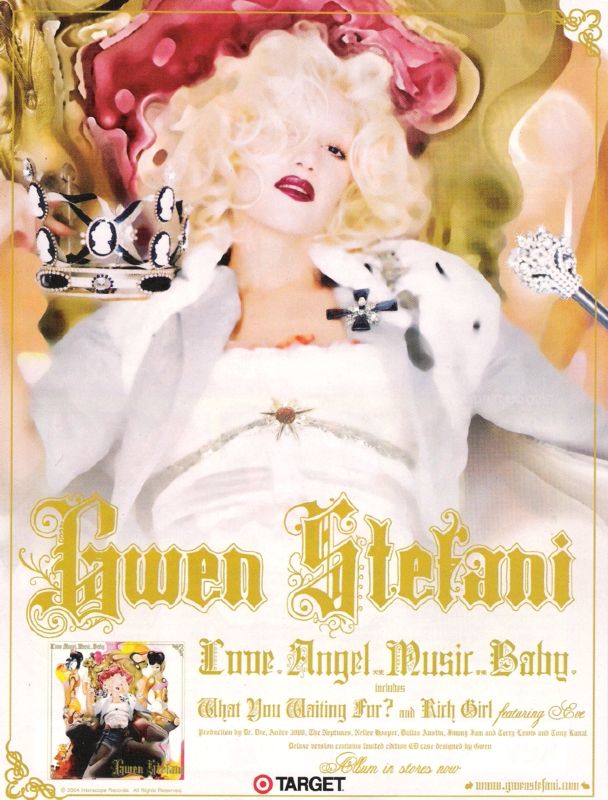
This album is Gwen Stefani's and this is her music magazine advert:
 What I like about her poster is that she includes a small photo of what the actual album front cover looks like. She looks very magestic as she in on her throne, with a crown and holding a sceptre. She looks like a princess which a lot of girls could relate to as this is what many girls want to be. She looks very seductive and as she looks straight down the camera lens she is inviting the audience to view her. The style of writing is quite girly and feminine which could appeal to just females, especially young girls. This advert also includes song titles, her website and her label. It also includes other text which I can't read which could be featuring artists or other information about the album.
Here is Jay Z's album cover and it also includes him on the front cover of the magazine "XXI":

Jay-Z's album is called 'The Blueprint 3' and it is quite simple however as it is bold it makes it a very striking advert. The magazine advert is an enlarged image of the album cover and it shows his name in a bold font, this is so that the readers know who the artist is. It is also a continuing of the play on words that he is BIGGER than hip-hop. The artist is shown as being bigger than the empire state building which is a famous landmark in America, this shows his status within the music industry, America and even world-wide. Also the fact that its the empire state building is illustrative to the song 'empire state of mind' which is one of Jay-Z's singles about life in New York.
The colour scheme is quite simple, including mainly greys which makes the flash of colour, red, really stand out. The running theme of these colours is also featured in the advertisement so that it is easily recognisable that they are related products.
Tuesday, 28 February 2012
Website Links
http://www.youtube.com/watch?v=bNB9Mepi1VI&feature=related
I used this link in the airbrushing of all of my pictures, it is a photoshop tutorial
http://www.dafont.com/deftone-stylus.font?text=JessieJ
http://www.dafont.com/exmouth.font?text=Who+You+Are
These links are where I found a lot of the fonts that I used in re-creating the Jessie J type fonts and others.
http://mattw.us/images/project/everything-has-changed/
http://mattw.us/images/project/futur-couture/
I also really liked the look of these pictures, which is where I got the inspiration to do the collaging, so I emailed him asking him how he did it, and he replied explaining.
Monday, 27 February 2012
Poster Ideas
This is another student's work that I think is really good. The pictures are copyright so I am not claiming that they are mine, I am only writing an analysis about them and taking inspiration from them.

This poster is a combination of all four of her posters. The top left poster used a photo that I previously blogged about; I really like it, and I like that she included that album cover on the poster (which appears in all four).

This comination of four posters concentrates on her lips, this is a good idea because Jessie J always focuses on her lips. I really like all of these posters however I don't think that it would really suit my poster.

This poster is really good, I like the simplicity and the similarities in the colours and she looks really stunning.

This is my favourite poster because she looks fun and it incorporates all of the conventions of Jessie J, for example her nails, lips and eyes looking sensual, her revealing some of her body, the varying colours and the font of Jessie J. I like that she included her album cover so that people can remember what the album looks like so that they will be more likely to buy it. This is the poster that I will take most inspiration from.
Sunday, 26 February 2012
Starting the Digipak

This is where I airbrushed Grace, making her skin look clearer and getting rid of any blemishes.

Here I added text and a 'light box,' I also edited her eyes by making them brighter and bluer.

I made the cover pink because it is my favourite colour but also because it will then co-inside with the pink of the car for the back cover.

This was the finished product, after the initial editing. I used this as the base picture for the front cover of the digipak.

1. In this draft, I instead made the colour darker, and didn't use the edit of the eyes, (I did this afterwards because I thought that it would look better if it could stand out that Jessie J is looking right at you). I like this one, however it looks too dark, unedited and a bit too boring for Jessie J.

2. In this edit, I made the picture slightly more pink however not as much as previously shown in the initial editing. I included more collaging which I really like, however if you look at Jessie J's actual front cover, its quite simple so I've decided that this one has just too much going on and is too 'busy'.

3. I really like this one because it is more simple, yet still shows off the collaging which I really like. However, although her eyes are edited, because of the pink tinting they don't stand out so much. I also don't really like where the text is because it cuts off her chin.

4. This one is actually my favourite because it is simple and her eyes are the most noticable. I prefer where the text is because it isn't in the way of her face and I prefer the colour as it is similar to her nails, however I don't think that the album name "Who You Are" stands out enough. It's a shame that it doesn't include any collage work however, this means that I can use this skill on either the inside or back covers.
-In the audience feedback, the most prefered front covers were number 1 and number 4 with 6 out of 20 votes each, however I don't really like number 1 so I think that I will go with 4. Number 3 was also really liked, getting 5 votes however only 3 people out of 20 said that number 2 was their favourite.
Saturday, 25 February 2012

Friday, 24 February 2012
YouTube
I've decided to add my video to YouTube to try and get views, comments and constuctive critism from a larger range of people. It is not completely finished yet, but here it is:
For some reason, when it was uploaded to YouTube it went out of time. It wasn't like this when I was editing it on Final Cut ProX and I hope that it won't save like this when I send it off to the examiners.
For some reason, when it was uploaded to YouTube it went out of time. It wasn't like this when I was editing it on Final Cut ProX and I hope that it won't save like this when I send it off to the examiners.
Thursday, 23 February 2012
Looking back at Other Music Videos again.
This music video that I previously looked at has around 194 different shots that I could count (give or take about 10 or so) and my video only has 50 which is a quarter of what they have!
I am worried that this might mean that mine isn't as good, however I am confident in my own work and I hope that this isn't a big issue; my song is a lot slower that this song and that is why I didn't opt to have as many shots. I also only used one camera which was really annoying, the reason for this was because the difference in camera quality between mine and the school's cameras was ridiculous.
I decided that it was better to have less shots then to have a varying quality between shots but to have a lot more.
This is the video that I found from another school that I am talking about:
Tuesday, 21 February 2012
Jessie J's album cover

This is Jessie J's album cover, as you can see her name is a lot bigger than the album name, "Who You Are." She also includes her hands alot in her pictures and her lips are a main focus too. I want to include my own ideas but take inspiration from them also. You can also see her teeth and the background is white; there is not too much actual editing of the photo however it does look really effective and I really like her eyes here.
Monday, 20 February 2012
My view on the audience feedback
My main issue with the video was the fact that the shots before the ones where she is running along the corridor are quite dark. However nobody picked up on this fact so instead of reshooting, as I don't think that I have any time, I've decided that it is probably just me being too picky.
The main issues that people said that I need to work on are:
- The shot at the end is too long, but I like that she finishes where she started.
- Maybe too zoomed in where she is outside the house
- Maybe too much use of the same effect unless this was planned as a running theme
- Prefered the original opening with less cuts as it starts slower
- Better to save the flashbacks for later on?
- Opacity still needs work
- Odd transition with mad Jessie
- Don't like the "pony" shot - too random
- Maybe have a 3rd jump cut with Bailey
- Final shot of mad Jessie needed? Definitely too long
- Love the ending when she is on the bed with Bailey, however I'm not too keen on the last scene of her back in the box - you want a happy ending - or maybe it is just too long.
Audience Feedback of Final Video
I showed the final video to my class that is on YouTube to get audience feedback as I wasn't too sure about the beginning, end and a few of the new shots that I had included.
- The shot at the end is too long, but I like that she finishes where she started.
- Good editing and match on action
- Good actor
- Good use of setting
- Lip syncing is good
- Maybe too zoomed in where she is outside the house
- Good use of shots
- Mood swings change with the song which I like, (tempo and lyrics)
- Change of outfits is good
- Bailey's appearance :D
- Happy ending, they are all back where they belong.
- Good use of cuts and effects
- Well timed
- Music in sync with the video and moods
- Maybe too much use of the same effect unless this was planned as a running theme
- Good effect of the windows scene
- Good use of slow motions
- Like the different costumes
- Love the bath scene
- Prefered the original opening with less cuts as it starts slower
- Better to save the flashbacks for later on?
- Opacity still needs work
- Odd transition with mad Jessi
- Don't like the "pony" shot - too random
- Maybe have a 3rd jump cut with Bailey
- Final shot of mad Jessi needed? Definitely too long
- Like the use of multiple angles and leggings
- flashback as if she is remembering who she is
- like how she starts with the narrative then starts to sing
- You have to watch the video many times in order to catch everything so this means that the audience will want to watch it many times (repeatability factor)!
- Good use of shots of her going on to the roof
- Like the ending - shows that this is the different parts of her.
- Really good establishing shot
- Love the scenes where she is in the garden i.e the swing
- Love the bit where she is in the sheets - looks to innocent!
- Great use of costume changes
- Love the lighting effects/slow motion shots of her running
- Looks so effective as she being raised on top of the building
- Love the ending when she is on the bed with Bailey, however I'm not too keen on the last scene of her back in the box - you want a happy ending - or maybe it is just too long.
Deciding on a Front Cover
I'm trying to decide on my music video's front cover, so if anybody could please comment and give me their opinion on which one works best, please?
Number 1

Number 2

Number 3

Number 4

Number 5

Number 6

Number 7

Number 8

Subscribe to:
Comments (Atom)