Powered By Blogger

Wednesday 29 February 2012

Music Magazine Adverts

Before I start my process of creating my music magazine advert I have looked at a few real adverts that have been made. Here are some of Jessie J's adverts:

On the left is Jessie J's platinum edition of her album "Who You Are" and on the right is the original album.
Text included is the original text used on the album, however a lot bigger.
They both state what the album includes, for example "PRICE TAG, DO IT LIKE A DUDE, NOBODY'S PERFECT & WHO YOU ARE" for the platinum edition and " #1 INTERNATION SMASH "PRICE TAG" FEAT B.o.B."
The platinum edition also includes brand new tracks that have been released since the original track.
Both include her website "jessiejoffical.com", her record label "LAVA" which is a part of "Universal Republic" which is also included.
On the platinum edition there is one other logo but I don't know what this is.
For my advert I might also include an iTunes advert to show where you can buy it and also a DVD logo to show that there are videos included in the digipak.


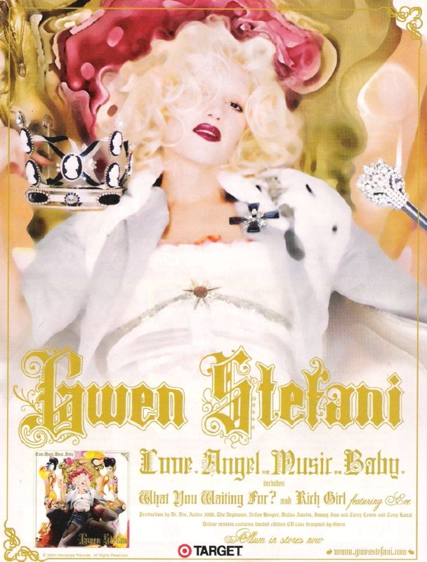
This album is Gwen Stefani's and this is her music magazine advert:
  • What I like about her poster is that she includes a small photo of what the actual album front cover looks like. She looks very magestic as she in on her throne, with a crown and holding a sceptre. She looks like a princess which a lot of girls could relate to as this is what many girls want to be. She looks very seductive and as she looks straight down the camera lens she is inviting the audience to view her. The style of writing is quite girly and feminine which could appeal to just females, especially young girls. This advert also includes song titles, her website and her label. It also includes other text which I can't read which could be featuring artists or other information about the album.
Here is Jay Z's album cover and it also includes him on the front cover of the magazine "XXI":
 Jay-Z's album is called 'The Blueprint 3' and it is quite simple however as it is bold it makes it a very striking advert. The magazine advert is an enlarged image of the album cover and it shows his name in a bold font, this is so that the readers know who the artist is. It is also a continuing of the play on words that he is BIGGER than hip-hop. The artist is shown as being bigger than the empire state building which is a famous landmark in America, this shows his status within the  music industry, America and even world-wide. Also the fact that its the empire state building is illustrative to the song 'empire state of mind' which is one of Jay-Z's singles about life in New York. 
The colour scheme is quite simple, including mainly greys which makes the flash of colour, red, really stand out. The running theme of these colours is also featured in the advertisement so that it is easily recognisable that they are related products. 
 

Tuesday 28 February 2012

Website Links

http://www.youtube.com/watch?v=bNB9Mepi1VI&feature=related
I used this link in the airbrushing of all of my pictures, it is a photoshop tutorial

http://www.dafont.com/deftone-stylus.font?text=JessieJ
http://www.dafont.com/exmouth.font?text=Who+You+Are
These links are where I found a lot of the fonts that I used in re-creating the Jessie J type fonts and others.

http://mattw.us/images/project/everything-has-changed/
http://mattw.us/images/project/futur-couture/
I also really liked the look of these pictures, which is where I got the inspiration to do the collaging, so I emailed him asking him how he did it, and he replied explaining.

Monday 27 February 2012

Poster Ideas

This is another student's work that I think is really good. The pictures are copyright so I am not claiming that they are mine, I am only writing an analysis about them and taking inspiration from them.

This poster is a combination of all four of her posters. The top left poster used a photo that I previously blogged about; I really like it, and I like that she included that album cover on the poster (which appears in all four).

This comination of four posters concentrates on her lips, this is a good idea because Jessie J always focuses on her lips. I really like all of these posters however I don't think that it would really suit my poster.


This poster is really good, I like the simplicity and the similarities in the colours and she looks really stunning.

This is my favourite poster because she looks fun and it incorporates all of the conventions of Jessie J, for example her nails, lips and eyes looking sensual, her revealing some of her body, the varying colours and the font of Jessie J. I like that she included her album cover so that people can remember what the album looks like so that they will be more likely to buy it. This is the poster that I will take most inspiration from.

Sunday 26 February 2012

Starting the Digipak

This is where I airbrushed Grace, making her skin look clearer and getting rid of any blemishes.

Here I added text and a 'light box,' I also edited her eyes by making them brighter and bluer.

I made the cover pink because it is my favourite colour but also because it will then co-inside with the pink of the car for the back cover.

This was the finished product, after the initial editing. I used this as the base picture for the front cover of the digipak.

1. In this draft, I instead made the colour darker, and didn't use the edit of the eyes, (I did this afterwards because I thought that it would look better if it could stand out that Jessie J is looking right at you). I like this one, however it looks too dark, unedited and a bit too boring for Jessie J.

2. In this edit, I made the picture slightly more pink however not as much as previously shown in the initial editing.  I included more collaging which I really like, however if you look at Jessie J's actual front cover, its quite simple so I've decided that this one has just too much going on and is too 'busy'.

3. I really like this one because it is more simple, yet still shows off the collaging which I really like. However, although her eyes are edited, because of the pink tinting they don't stand out so much. I also don't really like where the text is because it cuts off her chin.

4. This one is actually my favourite because it is simple and her eyes are the most noticable. I prefer where the text is because it isn't in the way of her face and I prefer the colour as it is similar to her nails, however I don't think that the album name "Who You Are" stands out enough. It's a shame that it doesn't include any collage work however, this means that I can use this skill on either the inside or back covers.

-In the audience feedback, the most prefered front covers were number 1 and number 4 with 6 out of 20 votes each, however I don't really like number 1 so I think that I will go with 4. Number 3 was also really liked, getting 5 votes however only 3 people out of 20 said that number 2 was their favourite.

Friday 24 February 2012

YouTube

I've decided to add my video to YouTube to try and get views, comments and constuctive critism from a larger range of people. It is not completely finished yet, but here it is:


For some reason, when it was uploaded to YouTube it went out of time. It wasn't like this when I was editing it on Final Cut ProX and I hope that it won't save like this when I send it off to the examiners.

Thursday 23 February 2012

Looking back at Other Music Videos again.

This music video that I previously looked at has around 194 different shots that I could count (give or take about 10 or so) and my video only has 50 which is a quarter of what they have!
I am worried that this might mean that mine isn't as good, however I am confident in my own work and I hope that this isn't a big issue; my song is a lot slower that this song and that is why I didn't opt to have as many shots. I also only used one camera which was really annoying, the reason for this was because the difference in camera quality between mine and the school's cameras was ridiculous.
I decided that it was better to have less shots then to have a varying quality between shots but to have a lot more.
This is the video that I found from another school that I am talking about:

Tuesday 21 February 2012

Jessie J's album cover

This is Jessie J's album cover, as you can see her name is a lot bigger than the album name, "Who You Are." She also includes her hands alot in her pictures and her lips are a main focus too. I want to include my own ideas but take inspiration from them also. You can also see her teeth and the background is white; there is not too much actual editing of the photo however it does look really effective and I really like her eyes here.

Monday 20 February 2012

My view on the audience feedback

My main issue with the video was the fact that the shots before the ones where she is running along the corridor are quite dark. However nobody picked up on this fact so instead of reshooting, as I don't think that I have any time, I've decided that it is probably just me being too picky.

 
The main issues that people said that I need to work on are:

  • The shot at the end is too long, but I like that she finishes where she started.
  • Maybe too zoomed in where she is outside the house
  • Maybe too much use of the same effect unless this was planned as a running theme
  • Prefered the original opening with less cuts as it starts slower
  • Better to save the flashbacks for later on?
  • Opacity still needs work
  • Odd transition with mad Jessie
  • Don't like the "pony" shot - too random
  • Maybe have a 3rd jump cut with Bailey
  • Final shot of mad Jessie needed? Definitely too long
  • Love the ending when she is on the bed with Bailey, however I'm not too keen on the last scene of her back in the box - you want a happy ending - or maybe it is just too long.
Although audience feedback is important I've decided that I am going to keep the ending because my aim was for her to end up where she first started and as her eyes close the screen is black at the end. I might play around with the beginning, maybe going back to what it was previously like and also work on the opacity. The scene after they look through the glass at one another also needs work and I might include a 3rd jump cut with Bailey.

Audience Feedback of Final Video

I showed the final video to my class that is on YouTube to get audience feedback as I wasn't too sure about the beginning, end and a few of the new shots that I had included.

  • The shot at the end is too long, but I like that she finishes where she started.

  • Good editing and match on action
  • Good actor
  • Good use of setting
  • Lip syncing is good
  • Maybe too zoomed in where she is outside the house

  • Good use of shots
  • Mood swings change with the song which I like, (tempo and lyrics)
  • Change of outfits is good
  • Bailey's appearance :D
  • Happy ending, they are all back where they belong.

  • Good use of cuts and effects
  • Well timed
  • Music in sync with the video and moods

  • Maybe too much use of the same effect unless this was planned as a running theme
  • Good effect of the windows scene
  • Good use of slow motions
  • Like the different costumes
  • Love the bath scene

  • Prefered the original opening with less cuts as it starts slower
  • Better to save the flashbacks for later on?
  • Opacity still needs work
  • Odd transition with mad Jessi
  • Don't like the "pony" shot - too random
  • Maybe have a 3rd jump cut with Bailey
  • Final shot of mad Jessi needed? Definitely too long

  • Like the use of multiple angles and leggings
  • flashback as if she is remembering who she is
  • like how she starts with the narrative then starts to sing
  • You have to watch the video many times in order to catch everything so this means that the audience will want to watch it many times (repeatability factor)!
  • Good use of shots of her going on to the roof
  • Like the ending - shows that this is the different parts of her.

  • Really good establishing shot
  • Love the scenes where she is in the garden i.e the swing
  • Love the bit where she is in the sheets - looks to innocent!
  • Great use of costume changes
  • Love the lighting effects/slow motion shots of her running
  • Looks so effective as she being raised on top of the building
  • Love the ending when she is on the bed with Bailey, however I'm not too keen on the last scene of her back in the box - you want a happy ending - or maybe it is just too long.

Deciding on a Front Cover

I'm trying to decide on my music video's front cover, so if anybody could please comment and give me their opinion on which one works best, please?

Number 1


Number 2

Number 3

Number 4

Number 5

Number 6

Number 7

Number 8

Saturday 18 February 2012

3rd Cut of the Video

Here is the final rough cut of my video, I haven't completely finished it yet because I want to conduct some audience feedback on a few clips that I'm not too sure of.


Here are thoughts that I want to consider
I'm not sure whether I like the initial flashback (2nd shot) and if it suits the set up of the video.
I want to know what people think about:
  • the other flashbacks in genereal
  • the bath scene
  • the different roof clips
  • if I have enough clips as I only have around 60 and I've realised that Jessie J's music videos range from 110-320.
  • The ending - whether it should end with Crazy Jessie in the box or a happier ending with the flashback Jessie on the bed with the dog.
  • Whether I need to include the piano scene
To do this, I might create a questionnaire that I will give out to my friends, family and the people in my class.

Thursday 16 February 2012

Bath Shots and Shots for the Digipak

Today I finally shot the bath shots which I think have worked quite well, however the first attempt where Grace is dry and then falls in and blows out her air isn't very good and I didn't want to get Grace to get ready again so instead I just asked her to do it again whilst she was still wet. In the end I actually prefer this shot, I'm going to put it in slow motion; I also shot her struggling to get out of the bath which I will use a few seconds later and she will finally manage to get out of the water at the word "breathe."
I also managed to take shots for my digipak that I will edit in Photoshop: